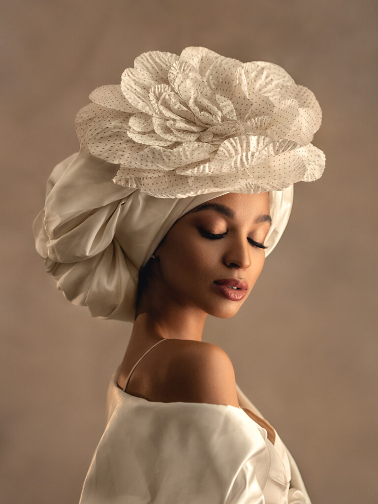
1. Tell us a bit about the image?
This photo was taken as part of my Workshop in Voronezh. When I come to my Workshop in this city, I always involve a well-known stylist in this city, who always comes up with interesting images. This is such a beautiful image she created for this model. I really liked the idea of such an unusual headpiece. Combined with a very beautiful model, with beautiful facial features with an unusual headdress I thought it would be interesting. My task was to emphasize this beauty with light, I used natural light from the window, a plain beige background. I wanted to get a sensual emotion. That’s what I worked on.
2. What inspired you to take the shot?
Mi sono ispirata alla bellezza della modella, sono molto appassionata di ritratti femminili, mi piace scattare immagini insolite e accattivanti. Mi ha ispirato il lavoro dello stylist che ha creato questa immagine.
3. What gear did you use for the shot including lighting?
I shot on a Canon R6 camera with canon 135mm lens, I used natural light from the window and the backlight was directed at the heroine from behind, in the form of a photographic torch
4. Tell us about the editing process?
There is not much processing on this photo. I worked with the skin of the model, made it smoother, removed small defects, also worked with toning on the photo, and added contrast.
5. How does this piece reflect you as an artist?
I propose to answer this question not just about this work, but about my work in general. I use Artistic Composition in photography to create harmonious and visually appealing images, similar to the way a painter places elements on a canvas. Photography is closely related to the play of light and shadows. I use light to create mood, to emphasize textures and shapes, much like a painter does with brushes and paints. I use a colour palette to convey the emotion and atmosphere of the photograph, similar to the choice of colours on a painter’s canvas. A photograph can tell a story or convey a certain message, just like art. Just like art, photography can evoke emotion in viewers. A great photographer is able to capture moments that inspire, touch, shock, or make you think.
social media pages.
https://www.facebook.com/mikhailova.school
https://www.instagram.com/lena.photo.ru/
Read MoreThe gem of Budapest
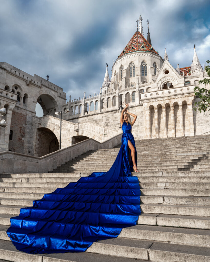
1. Tell us a bit about the image.
Budapest has a lot of famous sights, like the huge Fisherman’s Bastion. I always like to have a model, a person in the center of my photos, and -if it’s possible: add some extra, like this fabulous dress.
2. What inspired you to take the shot?
I am from Budapest, Hungary, and always wanted to display a location as something epic – with a model of course.
3. What gear did you use for the shot including lighting?
It was all natural lighting. The early rays of the rising sun shined on the model and the beautiful building.
4. Tell us about the editing process.
The dress was long enough to catch people’s eyes, but sometimes I needed to add some extra volume to it with Liquify. It was basically easy to edit, the weather was nice, the Bastion was almost empty and clean, it was about to pop the main colour a little bit more (blue), and subtract the secondary color: here yellow.
5. How does this piece reflect you as an artist?
I love to create fairy-tale moments, when women can have the time of their lives and shine in the photo. These adventures and memories are so precious.
Social media pages
Instagram:
https://www.instagram.com/sherryarelle/
https://www.instagram.com/6reasons_media/
dress company: @flyingdress_hungary
Facebook:
https://www.facebook.com/sherryarelle/


1. Tell us a bit about the image?
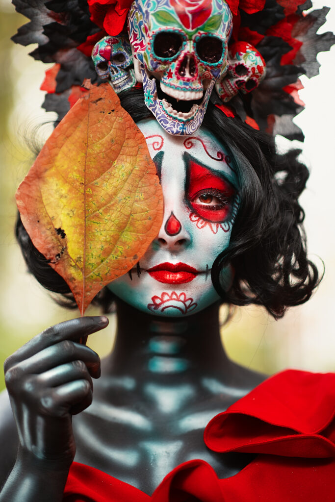
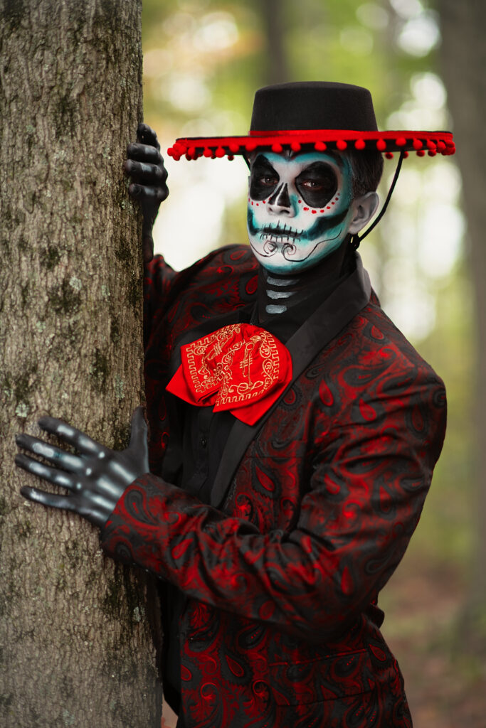
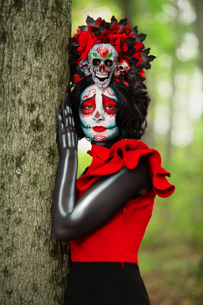
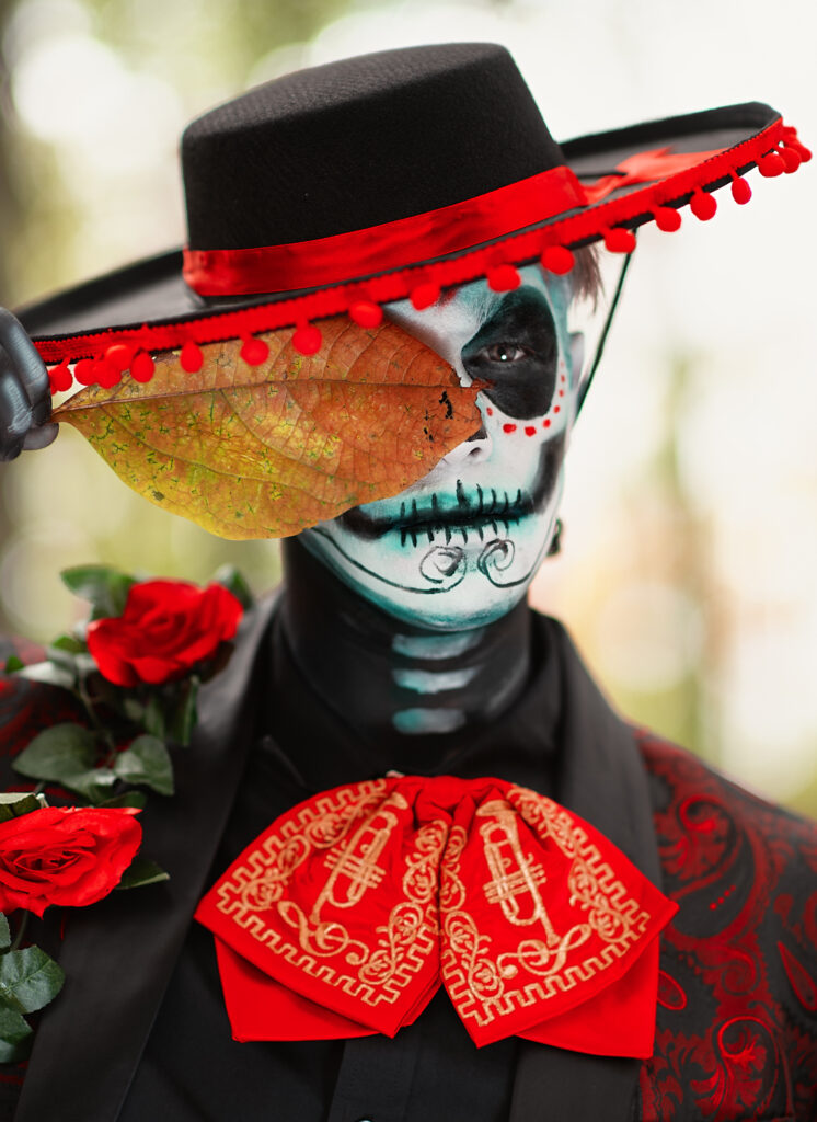
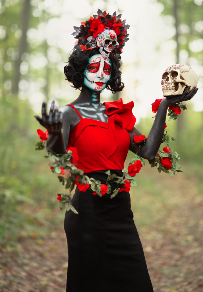
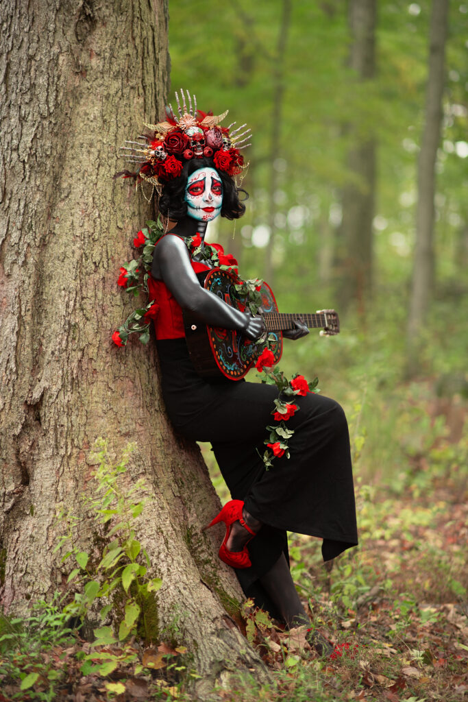
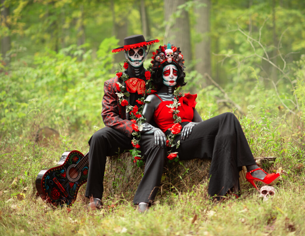
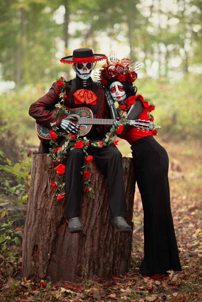
These images depict the Mexican holiday where they celebrate and remember their loved ones who have passed and welcome back the souls of the dead. A family reunion, you might say. My husband and I airbrushed the base of the makeup and then I hand-painted the faces and painted bones on the arms, hands, and chest. I also painted the guitar to add color and help separate the prop from the black of the clothes. For styling, I wanted to allow the faces to be the main source of color, so I chose red and black to play with the reds of the face makeup while allowing it to take a backseat to the colorful face makeup and expression. For background, I wanted a monochromatic background that would help make the colors pop as well–I knew a green forest would not only complement the red but allow the blacks of the clothing to help the couple pop.
2. What inspired you to take the shot?
The Mexican holiday Dia de Muertos, a celebration, reunion, and remembrance of loved ones who have passed inspired this shot.
3. What gear did you use for the shot including lighting?
I shot these with a Nikon D850, 85mm, and Godox AD400 with a 47-inch umbrella.
4. Tell us about the editing process?
Because Dia de Muertos is a colorful holiday, I wanted to bring a bold palette of colors to the forefront. I knew I’d have a vibrant red take center stage with a complement of green and cyan blue. In order to not overwhelm the eye, I wanted all shades of each tone to be the same. I started by adjusting all shades of red to the same red-orange so there was a harmony of the loudest color. Next, I worked on lush greens pushing greens more toward green than yellow and then adding vibrance to the blues. I then softened the background blacks with curves so the main blacks could pop with more contrast. I feel like the result was a harmonious balance of color and contrast that brings the ‘dead’ couple to ‘life’.
5. How does this piece reflect you as an artist?
As an artist who chases childhood, I recall joy like the smell of rain on hot asphalt. Dia de Muertos reminds me of that feeling. A celebration of life, hope, and eternal happiness. It is colorful, it is fun, it is promising. These are the shots that keep my inner child alive.
Social Media
Website https://store.taramapes.com/
Facebook https://www.facebook.com/enchantedeyecreations
Instagram https://instagram.com/enchantedeyecreations
TikTok https://www.tiktok.com/@enchantedeyecreations/



1. Tell us a bit about the image?
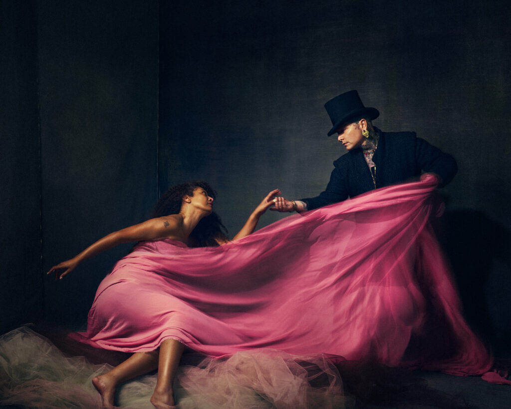
This image was taken in Jonny’s studio just outside of Denver Colorado. I visited Colorado for the first time and I wanted to explore the mountains as well as see local art. I reached out to Jonny because he is an artist I greatly admire. I asked Jonny to maybe have a cup of coffee with me, as I just wanted to meet him and talk all things art related. However it was his idea to meet at his studio called Atelier Alchimia, and he proposed we have fun while getting to know each other and photograph each other. I was so excited about this opportunity, and I also thought since we are both self portrait photographers, that we should collaborate on a joint self portrait image.
2. What inspired you to take the shot?
I was inspired by the size of Jonny’s studio, and his huge range of photography props and extensive set design in the studio. Jonny has a very unique look which is memorable. If you do not know him, you might find his appearance to be a bit intimidating. But this is so far from the truth, as he is a very personable and friendly person. I proposed to johnny, that we shoot a joint self portrait as he…being this dark, ominous figure, unapproachable, and threatening. And I would encompass the complete opposite, soft, flowy, delicate and kind person. I absolutely love the song Gravity by Sarah Barellis. It has been such a favorite song of mine for years, because it can be interpreted as someone wanting to break free from what is holding them down. We all have our struggles, and I thought this theme would work nicely to help push the story of our join self portrait.
3. What gear did you use for the shot including lighting?
For the shot, we used constant light by Nanlight. We used a Forza 300B Bi-color light. We also used a Forza 500. Our Camera were both Sony mirrorless bodies. Mine was a Sony A7iii, and I used a 24-105mm lens.
4. Tell us about the editing process?
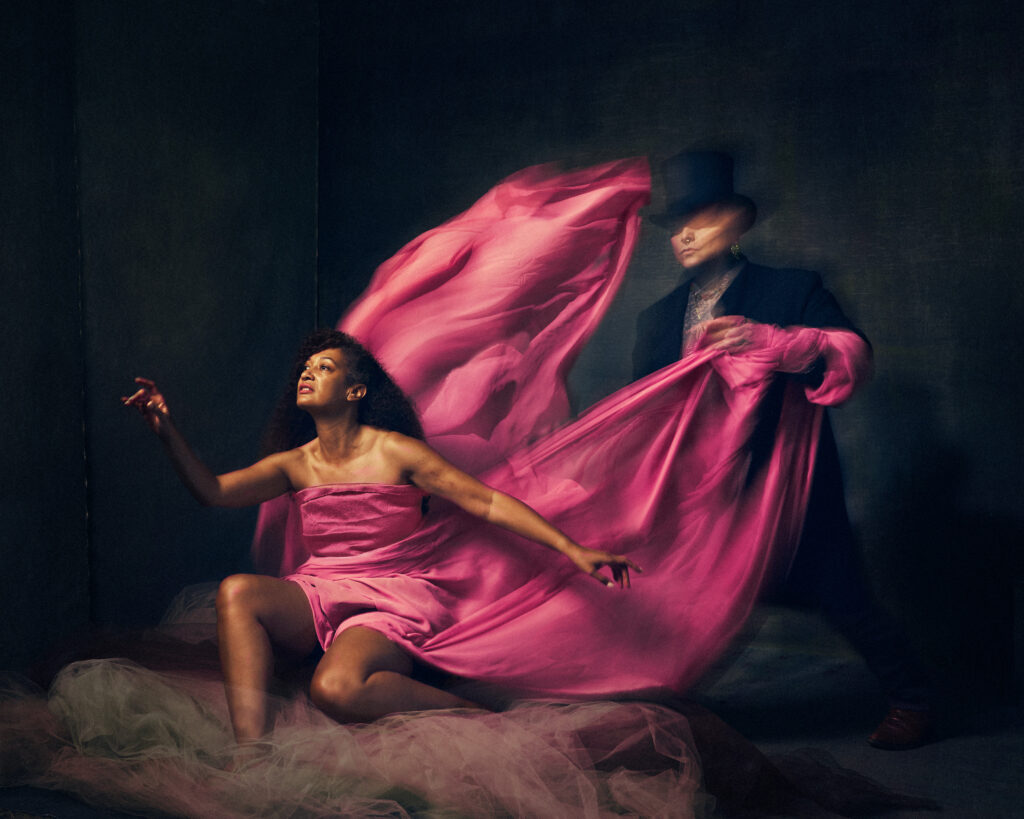
I can only speak about my editing process. We shot the images using a very slow shutter speed in order to capture the movement of the fabric. We made the fabric move continuously using shutter drag, while I stayed completely still. Jonny kept moving as well, because we felt it was important for the story to depict him as an almost unrecognizable figure. I did the primary tonal adjustments and color grading in capture one. Then I finished with targeted adjustments in photoshop. What we captured on camera was pretty close to what I envisioned as the final outcome. But the targeted color grading, and complimentary color on the color wheel really helped to solidify our overall vision.
5. How does this piece reflect you as an artist?
I thought it was really important for the story to be told in a small series of images. So I edited my images to be a tryptik (3 images together as a panel, displayed together). For the first image, I am showing the relationship and interpersonal connection between myself and this ominous figure. I am holding on to what is familiar (although what is familiar is not always good for us). The send image, I demonstrate a disconnect and break from that which holds me back (the figure) and looking onto an open space full of opportunity and optimism. The third image just shows Jonny, alone looking confused, displayed, disappointed and defeated. This rapture of energetic movement is still present in the image (you can see the motion in the fabric) as he realizes I have broken away from the gravity that was holding me down. As an artist, I feel we have the ability to interpret and tell a story that is not only personal to us, but ambiguous enough so that others can connect to it.
SOCIAL INFORMATION…..
https://www.marybelphotography.com/
Join Our facebook Group – www.facebook.com/groups/artofportraitphotography


Tell us a bit about the image?
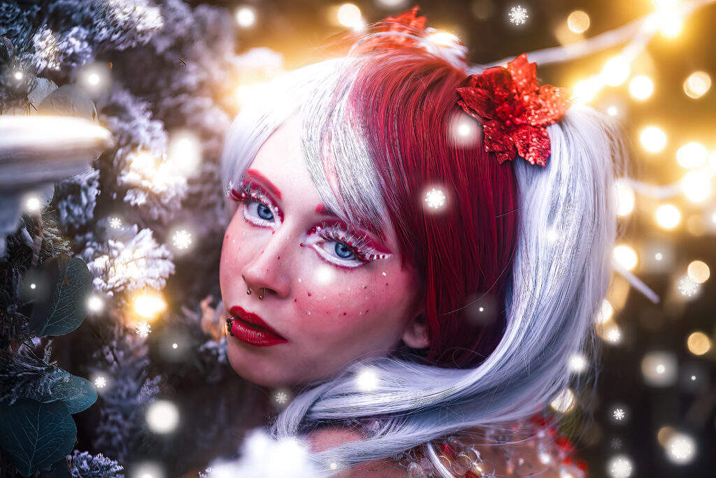
Kailyn Lance and I have been working together for several years, and in each session, we just have this fantastic transformative experience where we really get to dive into our art and just bring out the best in each other.
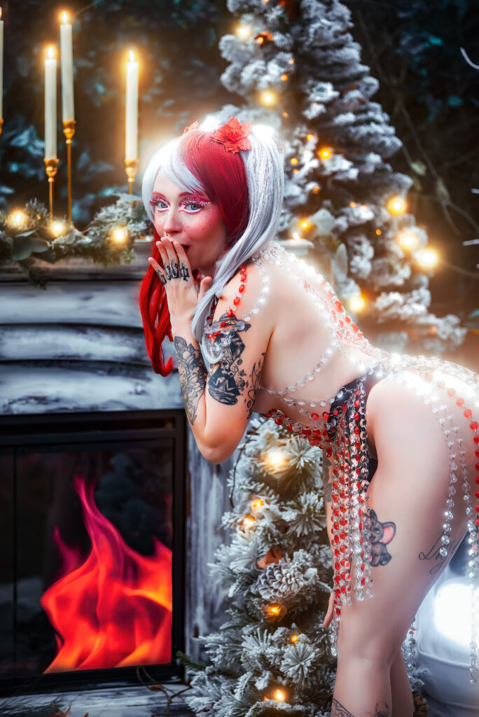
This Body piece is an original design and was handmade by myself. I utilized red and clear chandelier pieces to mimic the striped pattern of a classic candy cane look. For the hair, I purchased a wig and stylized and embellished it with foam candy and poinsettia baubles. My incredible hair and make-up artist, Olivia Lee, owner of GOREgeous Make-up by Liv, created a fantastic look combining editorial make-up with fun candy and anime-style elements that tied the entire piece together.
We held the session at Disheveled Decor, a beautiful backyard venue in Virginia Beach. The set was stylized by Brooke Grindle and featured evergreens, Christmas lights, faux snow, a fireplace, rugs, a couch, and candles on golden pillars.
What inspired you to take the shot?
This session was Candy Cane inspired, and we wanted to capture the fun and whimsical vibes of this seasonal treat in a new and unique way that we haven’t seen before.
What gear did you use for the shot?
We had perfect lighting the day of the photoshoot, so I set aside my flash and used natural light and my D750 coupled with a Tamron 2.8f 70-200 lens to capture the Christmas tree images. When we moved into the bubble tent, I switched to my Nikon 24-120mm f/4 and set up my light wand on top of the tent to light Kailyn with continuous lighting.
Tell us about the editing process?
We wanted to emulate the feeling of whimsy with these photos, and to accomplish this look, I added a lot of painterly style editing to the final images. I used portraiture, frequency separation, dodge and burn, clone stamping, overlays, color grading, and lightroom effects to refine the photos. Then I added a beautiful glow effect with my Oniric Photoshop plug-in.
How does this piece reflect you as an artist?
The resulting piece is incredibly reflective of my art as a whole. I am both a runway designer and a fantasy/boudoir photographer, and in this piece, I was able to combine all elements of my art. From the originally designed body piece, handcrafted by myself, to the gorgeous painterly look of the final images, this entire session was curated to be reflective of my current place in my artistic journey. I can not express how proud I am of myself and my amazing team of fellow artists.
Photographer: @lela.smith.photography
Model: @lancekailyn
Body Chain Set: @lela.smith.photography
HMUA: @goregeousmakeupbyliv
Set Designer: @disheveled_decor_llc

Join Our Portrait Group on Facebook
The Art Of Portrait Photography
Read More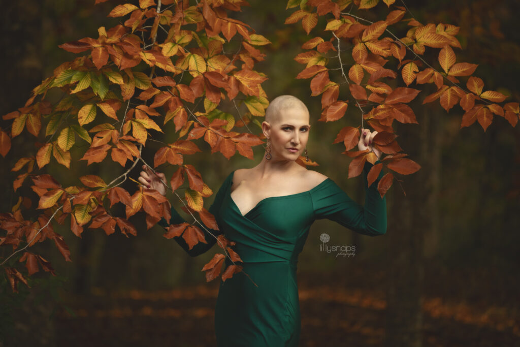
1. Tell us a bit about the image?
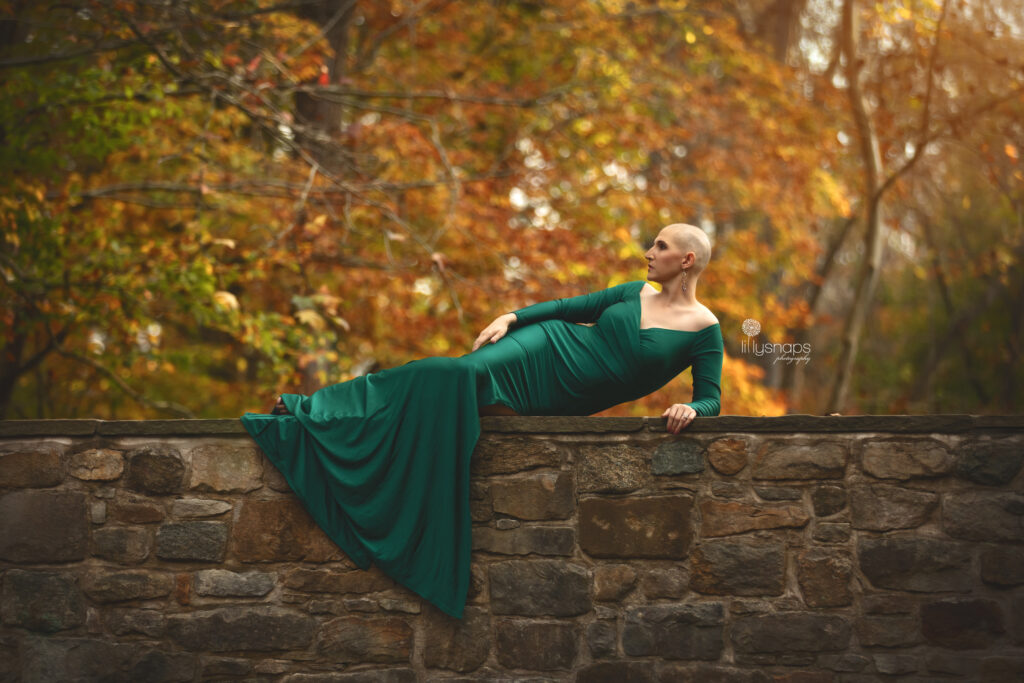
My friend/client reached out to me a couple of months ago telling me what she was going through and that she wanted to do a session with her bald head. We immediately started brainstorming about what she should wear, whether should we paint on her head or should we do some sort of headdress etc. We just decided that it should be simple and elegant.
2. What inspired you to take the shot?
We were going to do the session in a field area near my house but I wanted this session to have a more magical feel. I had not shot at this location yet and checked it out this summer and knew this was the place we needed to go.
3. What gear did you use for the shot including lighting?
I used the Canon 5D Mark iv and used the 85 1.2 (for the red dress) and the 70-200 2.8 (for the green dress.). The lighting is all-natural light and has no reflectors.
4. Tell us about the editing process?
Editing: I smoothed her skin (which was already pretty flawless) and used an action I created that gave it a little bit of a vintage look then used a Greater Than Gatsby Painterly action at about 20% strength and brushed off her face.
5. How does this piece reflect you as an artist?
I love being creative and trying to bring out the personality of the people I photograph.


https://www.facebook.com/Lillysnaps
instagram. @lillysnaps
Read More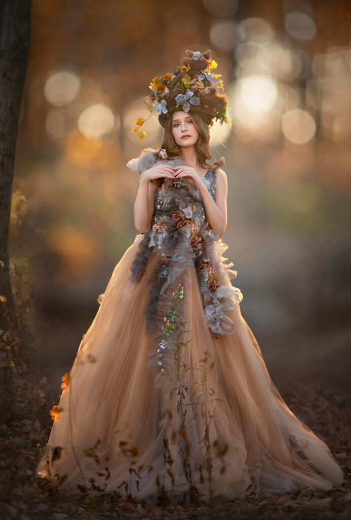
1. Tell us a bit about the image?
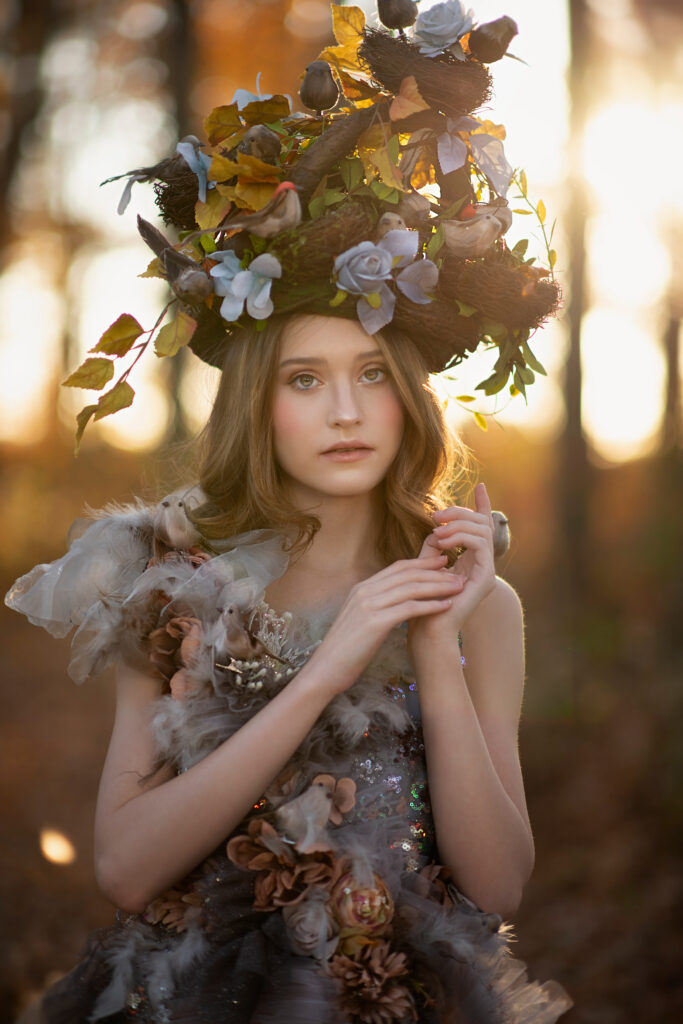
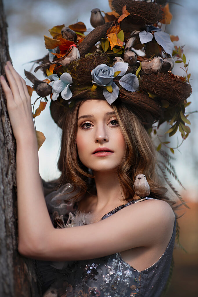
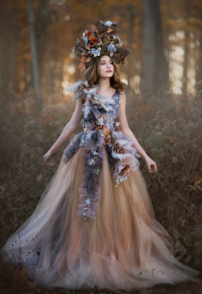
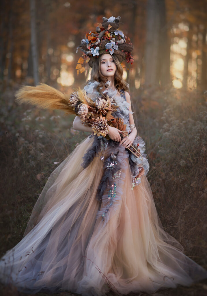
This set was shot at the heart of Autumn at sunset. I wanted to tell the bittersweet story of Mother Nature’s Fall farewell. I asked my sister Tia, The Head Mistress, to make a dramatic headpiece with birds and bird nests to match a gown made by Fairyshop, one of my favorite designers in Hungary. I added little birds to the gown to bring the piece together and focused on the blues and browns of Autumn knowing the complementary Autumn backdrop of oranges and yellows would tantalize the eyes.
2. What inspired you to take the shot?
Nature is my inspiration, always. From childhood, nature has been my teacher, my refuge, my love. Autumn is a beautiful serenade to life, transformation and hope. Autumn represents a time in our lives where we are experiencing change and loss. Like leaves on the arms of strong trees, we must have the courage to let go. It is bittersweet. Jenna, the model, captured the mysterious melancholy and the ethereal song of Autumn with her sorrowful gaze and delicate appearance. Combined with the glowing golden stage set by Mother Nature and the gown and headpiece, Autumn’s story is told.
3. What gear did you use for the shot including lighting?
I shot this set with my Nikon D850, 85mm lens, and Godox AD400 with a 47″ umbrella. I knew I would choose to backlight some of the shots and also allow a peek from the sun in some to create a warm haze. The Godox helps counter the darkness of a backlit shot and illuminates the face to give it a warm glow–setting myself up for a simpler editing process. Having proper lighting and knowing how to use it can completely transform results both outdoor and in studio. I am a huge OCF fan and love to experiment with different lights, techniques, angles and styles.
4. Tell us about the editing process?
Editing is cathartic to me. I really enjoy the process of taking the image and transforming it into a combination of what I saw in real life and what my mind sees. I edit in Photoshop by hand with a focus on a painterly + fine art finish that helps the subject pop, and the use of colors to create a harmonic visual. I use the healing brush to remove imperfections in both the subject and the scene to reduce distractions. I use curves layers to even tones and frequency separation for the skin. I often prefer true colors that are bold and reflect what our eyes see. I will accentuate certain colors and often go to color.adobe.com and slightly change the hue of certain tones to create that visual symphony.
5. How does this piece reflect you as an artist?
Much of my work is a reflection of my inner child. I chase the nostalgia of childhood, the way the grass felt between my toes, the sounds of the locusts serenading summer, the crunch of leaves beneath my bare feet, the trickles and swooshes of the creeks, the warm buttery sun on my skin, the smell of rain…. All of it influenced me in such a way that I want to recreate those feelings in images. I relive those moments in each shot and when they resonate with others, maybe …just maybe it will awaken the inner child of the viewer. Maybe they will remember, too. The beauty of unawareness, the innocence….and the time where we lived in the present, in awe, without distraction, and sought answers in the world around us. I want to marinate in it and when others appreciate it and see it, too. It’s a gift I am so grateful for.




Social:
Website: https://www.taramapes.com/
Facebook: https://www.facebook.com/enchantedeyecreations
Instagram: https://www.instagram.com/enchantedeyecreations/
Tiktok: https://www.tiktok.com/@enchantedeyecreations/
Headpiece: https://www.facebook.com/theheadmistresscouture
Dress Designer: https://www.facebook.com/fairyshopbyszilvia
Read More
1. Tell us a bit about the image?
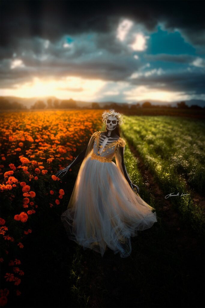
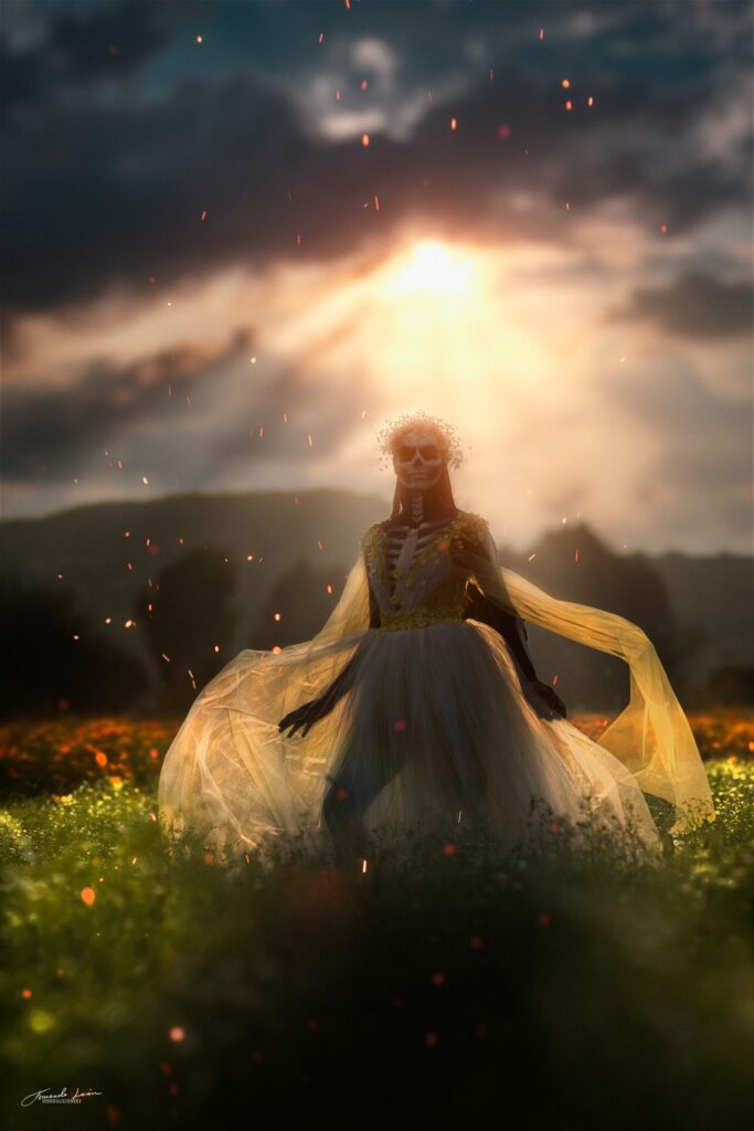
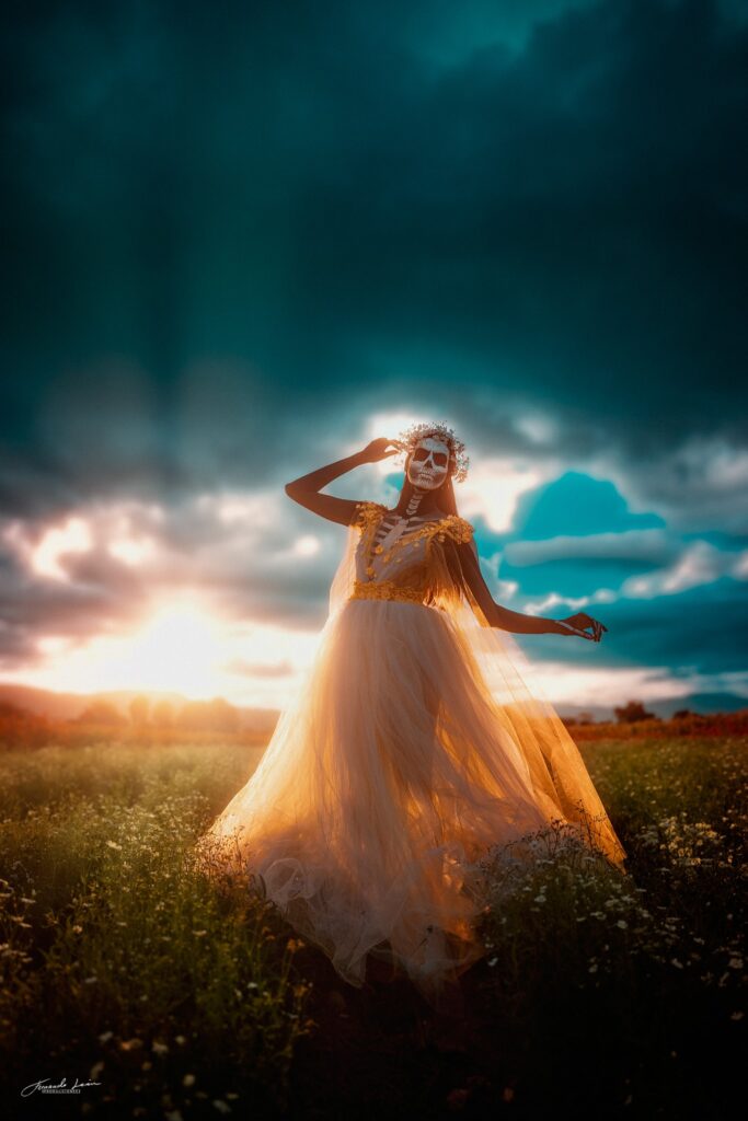
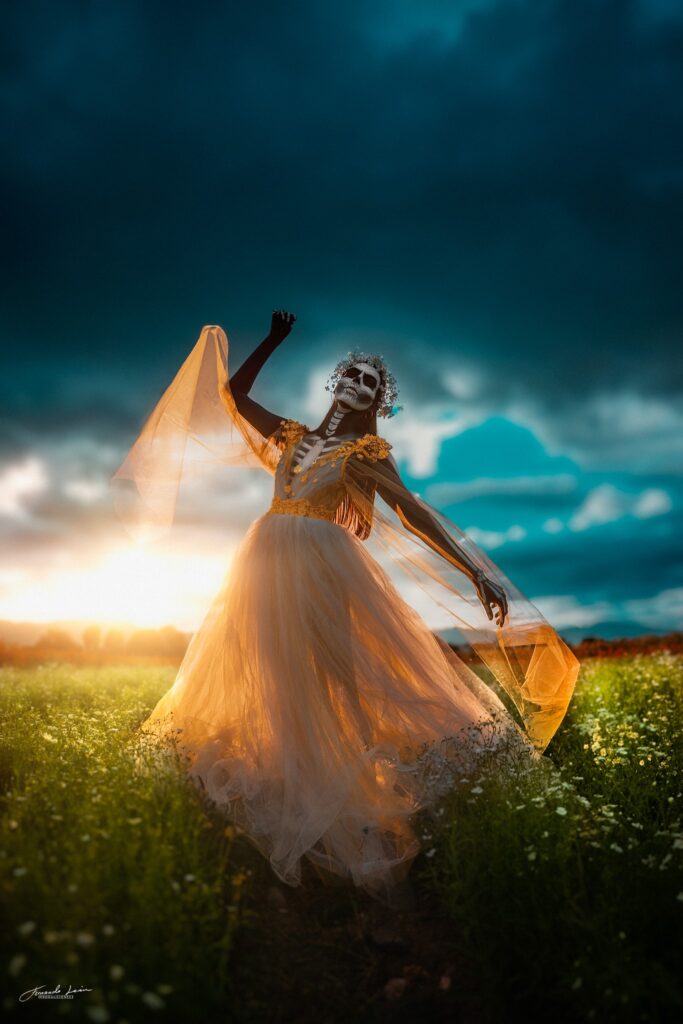
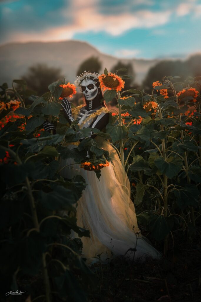
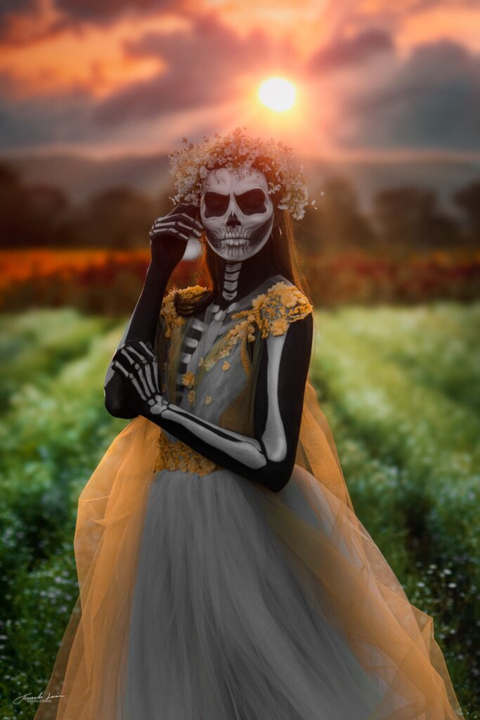
The “Catrina” or “Calavera” born by Guadalupe Posadas, he’s a Mexican artist who creates the “Calavera” as a critic of the lower class Mexican society that, by improving their economic income, denied their indigenous roots and believed they were of a European or foreign race. The purpose of his work is to say “we are all the same inside. Today, we add this idea to our traditions as an essential part of the celebration as part of the same idea of the premise of “Posadas”. This piece is a new proposal of the “Calavera”, a woman coming of “Mictlan” (underworld of aztecs) that at some point he lived on our earthly plane, and I love life so much that he can’t leave it entirely, romantic and soft, who loved the smell of cempasuchil and the magic of sunset.
2. What inspired you to take the shot?
What inspires me to create these works almost every year is the same thing that drives our traditions. We Mexicans do not celebrate death, we celebrate life, that is why on the altars of “Día de muertos” we put the food or the objects that our loved ones liked in life. We are celebrating his life and remembering him with the belief that on November 1 and 2 they visit our plane to reunite as a family. “life, family, and love for the land where I was born” is my inspiration totally. I like to imagine and indicate to my actress or actor a life with certain essential characteristics that they will have to interpret, “romance, courage, passion, love, fragility, disdain, or even, why not? arrogance.
3. What gear did you use for the shot including lighting?
All photos except 1 placed in the album are taken with natural light. To do this, use the following equipment: NIkon D7200 + AF-Nikkor 85mm 1.8D, Sony A7 Mk1 + Tamron 24mm 2.8 and an Amazon Basics polarized filter. The Yongnuo YN560iii Flash Speedlite
4. Tell us about the editing process?
My favorite part, I process the raw image in Adobe Lightroom and work with colorimetry, lights, and shadows, I use this as the base for work later in Adobe Photoshop, where I work with special effects, correction of makeup, and other errors arising the moment the model moves, she sweats or pinks with her dress. Also, i accentuate the colors previously prepared into LR, add filters and opacity, taking care not to dirty the Makeup.
5. How does this piece reflect you as an artist?
The effort, when I started in the wonderful world of photography, like many others, I received extremely negative and deplorable comments, but my desire to learn and my ideas always drove me, and the support of my partner, family, and friends, always kept me from cake. I longed to have the ability to one day capture the ideas in my head in my photographs, and 10 years later I can say that I am on one of the steps that I saw far away back then. Today, I know that the sky is the limit, and I want to conquer it, not because of arrogance, but because of my heart.
My name is “Efraín Peñaloza” but my brand is “FERNANDO LEON”, this name emerges from a fictional character from my book “into the rocks” and I used it for my artistic proposals
Social Media Pages
Instagram: https://www.instagram.com/fernandoleonphoto/
Facebook: www.facebook.com/fernandoLeonPhotography


1. Tell us a bit about the image?
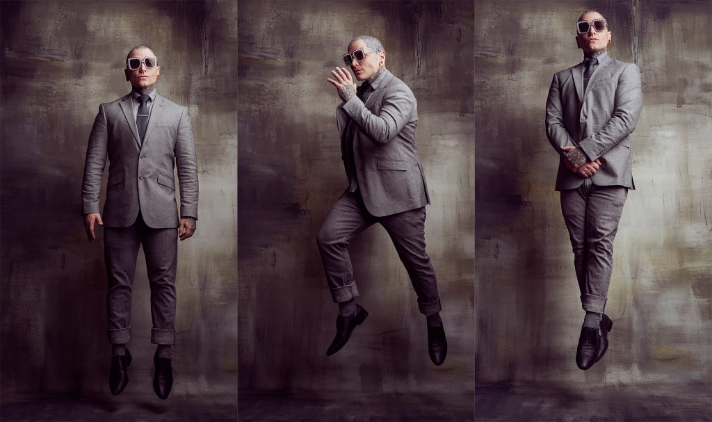
The featured image is a series of self-portraits that I recently created in my studio. I strongly believe that self-portraiture is an essential tool for creative-experimentation and defining one’s own visual voice. Beyond being a conduit for artistic evolution, self-portraiture essentially puts us in the position of our clients|subjects, whom we ask to step in front of the lens and be open, vulnerable, and receptive. To that end, recently, I’ve been pushing myself to be more creative and intriguing when producing self-portraits; plus, as a fashion photographer, I adore movement and imagery that feels dynamic.
2. What inspired you to take the shot?
Well, recently, I commissioned a bespoke canvas backdrop from The Obsidian Studios–whom I am an ambassador for; full disclosure–and was anxiously awaiting its arrival. Once I had it in my hands, literally and figuratively, I felt inspired to put it through the creative-paces and knew that there was no better way to do so than shooting self-portraits. I really love juxtaposition, in photography, and thought that it might be unusually engaging to create movement with my body while retaining a relaxed, dapper demeanour both in my wardrobe and expression. Externally, I find myself most intrigued by, and inspired by, photographers of the bygone era–Philippe Halsman’s “Dali Atomicus” has always held a special place in my heart. I’m sure that his work, and that specific image, was a force of inspiration as well.
3. What gear did you use for the shot including lighting?
The setups for my self-portraits tend to be quite basic, for the simple reason that it’s significantly easier to manage fewer moving parts; especially, when playing the dual role of photographer-subject.
Recently, I made the jump from Pentax to Sony, and couldn’t be happier, so I decided to use my new(ish) Sony A7RIV paired to the Sigma 35 1.4 ART. Honestly, it’s my favourite combination and I adore the 35 focal range. Courtesy of Sigma, the 35 1.2 is on the way and I am beyond giddy! That’s a story for another time, however!
I tethered that duo to my computer using a setup from Tether Tools. Whenever possible, I love to tether. For me, doing so is really important when I’m shooting self-portraits as I can deconstruct my timing, expression, posing, etc. without having to strain or guess.
For lighting, I used a single Flashpoint XPLOR 600 combined with a 60” EZ-Lock Octabox from GLOW. One, of many, thing(s) I love about the EZ series from GLOW is that the modifiers all include a beauty-dish-like diffuser disk. The disk ends up creating a pseudo-indirect setup that helps to further spread and soften the light. I set the light a tad high(er) than normal, to accommodate the jumping, angling it down a touch. With a bit of feathering, the setup produced a flattering, soft, wrapping light that allowed for a lot of levity in terms of movement and position.
4. Tell us about the editing process?
Because, honestly, I’d rather be shooting than editing, my post-production workflow tends to be as efficient as possible. The vast majority of my processing tends to occur in Capture One. For me, C1 produces the best colours, and files that are sharper/cleaner than anything else on the market. Post C1, the files were opened in Photoshop only to polish the colours a bit – using the amazing Infinite Color Panel. Literally, 99% of editing was completed in C1. Recently, I’ve been diggin’ the 3D LUT profiles from PRO EDU. I find, at low(er) opacities, that the LUTS create rich, tonal harmonies that get my images to where I want them with the least amount of effort, before ever moving on to PS. Each image took less than 10 minutes–probably closer to 5–to edit.
5. How does this piece reflect you as an artist?
I’d like to think that my work|art is narrative-driven. The imagery that I aspire to create is focused on whoever is in front of my lens; their respective stories and journeys. The greatest gift that photography has given me is the capacity to connect and to parlay that connection to help others share pieces of who they are. In that process of their revealing, I am afforded the chance to reveal a bit of who I am as well. I’m immensely honoured, whenever someone decides to step in front of my lens, and do my best to honour and empower them as individuals. In essence, my self-portraits are an ode both to the individuals I am fortunate enough to photograph and to myself as an individual. They’re an exercise in gratitude when all is said and done. Also, I like to have fun! In my humble opinion, we’re so fortunate as artists, to be able to create, capture, and share; and, to me, life is too short to not enjoy every moment of the creative process, insofar as we can. The only thing louder than destruction is creation; let’s laugh and smile, while we create!
Read More
1. Tell us a bit about the image?
I had just finished a full set for a designer with the model, and I literally wanted to take an additional image in studio, I shot 4 of these and this one was my fav.
2. What inspired you to take the shot?
To be creative is fun, but I always want to do a more stoic, serious studio shot of every person I shoot.
3. What gear did you use for the shot including lighting?
This is an old image, I was still on the Canon system. Canon 5D MkIII + 85mm 1.2 – The settings were 5.6 Shutter was 200 and iso was 100�I used a Mola Demi Beauty dish directly overhead with a reflector beneath the model for a bit of fill.
4. Tell us about the editing process?
This is a basic edit, strictly light retouching using the patch tool on the skin with color toning. Sometimes less is more.
5. How does this piece reflect you as an artist?
I’m leaning towards less editing for 2020. Thought I’d try something new!
Social Media
Instagram: https://www.instagram.com/nikkiharrisonphotography
or my Digital Art Insta is https://www.instagram.com/nikkiharrisonart
Facebook Business page: https://www.facebook.com/nikkiharrisonartist/
Facebook Digital Art Page: https://www.facebook.com/Nikkiharrisonart/
Youtube: http://www.youtube.com/c/NikkiHarrisonphotographer
Teachable School for editing Tutorials: https://nikki-harrison.teachable.com


Recent Comments